
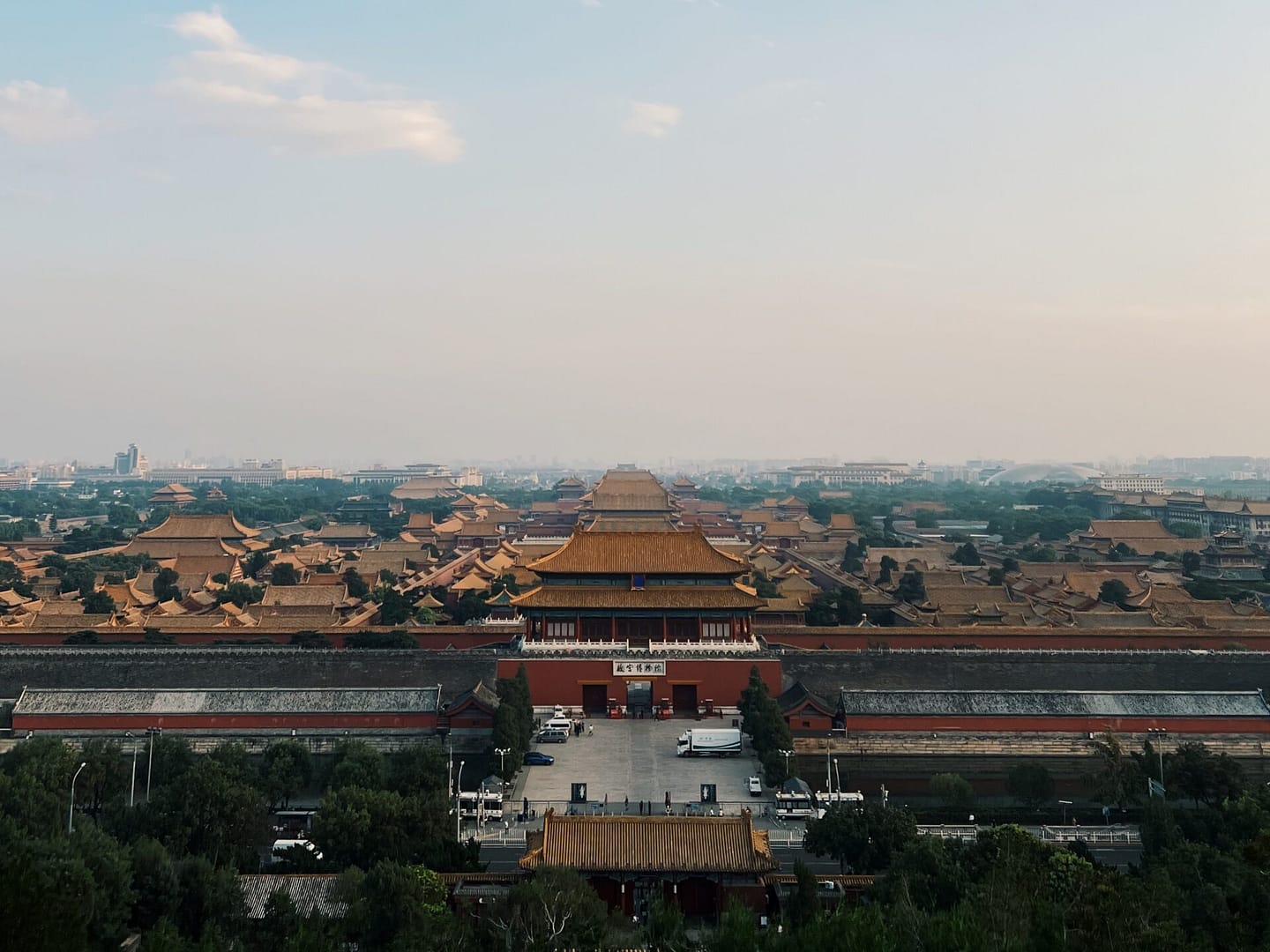
“They do everything big here.”
I would catch myself saying this out loud every single time I visit the tourist-y spots of Beijing. The parks are big, the old palaces are big, and then there’s that wall that’s admittedly great.
Size is only the tip of this iceberg, though. The more I travel around the city, the more obvious it’s becoming to me that Chinese culture is one that is heavily focused on form and structure.
And the more time I spend here, the more I feel the city teaching me its ways.
This is obvious in the intentional symmetry of the architecture—symmetry is a key feature in all temples and parks I’ve been to so far. But what’s unknown to many is that the same attention to balance is present in the language as well, specifically grammar and sentence construction.
Two-character adjectives are paired with two-character nouns; two-character nouns are paired with two-character verbs. This is what makes a well-balanced sentence in Chinese. It reads good, sounds good, feels good. This is an oversimplification but you get the point.
I sometimes forget that the Chinese characters I write everyday as I take notes in class are manifestations of this peculiar attention to form. If you’re not familiar, Chinese words, particularly the older and more basic ones, is made of pictograms. They’re literally simplified images of actual objects that have evolved to their present forms.
For instance, the Chinese word for “person” is 人, which sort of looks like a person walking. “Tree” or “wood” is 木, which looks like a trunk with branches on the side. Put those two characters together, we get the word 休. It looks like a person standing—or sitting—beside a tree. This is the word for “rest.” Pretty clever, I think.
Three weeks ago, I started taking classes on Chinese calligraphy.
I was so excited for the first session that I bought new brushes, paper, and ink, forgetting that I had already owned an unused set from last year.
We spent the first 30 minutes of that first session practicing the Chinese word for “1” which—for the uninitiated—is basically just a horizontal line: 一. 30 minutes for a single line. Again, dedication to form.
As I continued marking my paper with stripes, I thought of all the words I wanted to learn to write with the brush. I thought of all the idioms and poems I’d like to practice with. I thought of how even the shortest Chinese phrases contain the deepest implications and the richest stories. I thought of how the manner in which a character is written should do justice to the meaning behind word.
After all, what is substance without the form that carries it?
It’s funny, I used to hear this question a lot, but in reverse. I think, I’ve always prioritized substance above form, sometimes to the point of completely forgetting structure altogether. It’s only in recent years that I paid more attention to the latter.
I’m reminded of Aristotle’s theory on persuasive appeals.
He wrote about this in his work On Rhetoric: A Theory of Civic Discourse. Many refer to it as the Rhetorical Triangle: Ethos, Pathos, Logos.
Put simply, Ethos is the speaker—their credibility and character. Pathos is the appeal to the audience’s emotions—tone and manner of speech. Logos is the substance and logic of the argument itself. All three elements make up any type of speech or message. According to Aristotle, all three are essential to persuasion.
Very practical advice. In public speaking, or any form of communication for that matter, we look for the right blend of all three. Eloquence and effective messaging depends on this balance.
However, what I’m also learning through this deep cultural immersion in Beijing is that logos and/or ethos can also rise in the pursuit of pathos alone.
Balance can also be found in the oneness of the approach.
With calligraphy, the concentration on form and the strokes trains the ethos. It gives me credibility as I practice. At the same time, the focus on look and feel provides meaning, as any form of art does by way of beauty and aesthetics.
I’ve seen calligraphy styles that are so outlandish you can hardly read out the characters, but it’s the style—that evidently has been developed over a long period of time—that provides the meaning, character, and even some form of logic to the word. The form creates the substance.
The opposite is also true. In many cases, design is simply how something works. Something is beautiful because it is functional and seamless. A few things that are beautiful because “they just work”: Apple products, Squarespace websites, Google Search, Dyson vacuums.
Form by way of substance. Pathos derived from Logos.
Before I came to Beijing, I had a conversation with my friend and mentor Rofel Brion, whose poetry and prose I would read whenever I find myself unable to write.
I told him about wanting to write more poetry. He suggested that I try calligraphy as well. We discussed the logographic nature of Chinese characters, and the depth of meaning each character carries. “Perfect,” he concluded, “every word is a poem.”
There’s a dance that goes on within each piece of work.
It’s a dance among the Logos, Pathos, and Ethos. Sometimes all three share center-stage. Other times, one takes the lead.
If we look closely enough, we notice this in the design of the shoes we wear, in the thoughtfulness of the apps we pay for, in the videos we watch while we scroll mindlessly, in the last piece of art that moved us, in the last voice message we received from a friend.
Roman Mars of 99% Invisible put it nicely when he said: “When you decode the world with design intent in mind, the world becomes kind of magical. Instead of seeing the broken things, you see all the little bits of genius that anonymous designers have sweated over to make our lives better.”
Whether we are witnesses to the end result of creation or the ethos behind it, it is in awareness this dance where sparks of awe and inspiration usually lie.